Tool · · Reece Mitchell
UK Crime Landscape
Crime on a map, not in a spreadsheet
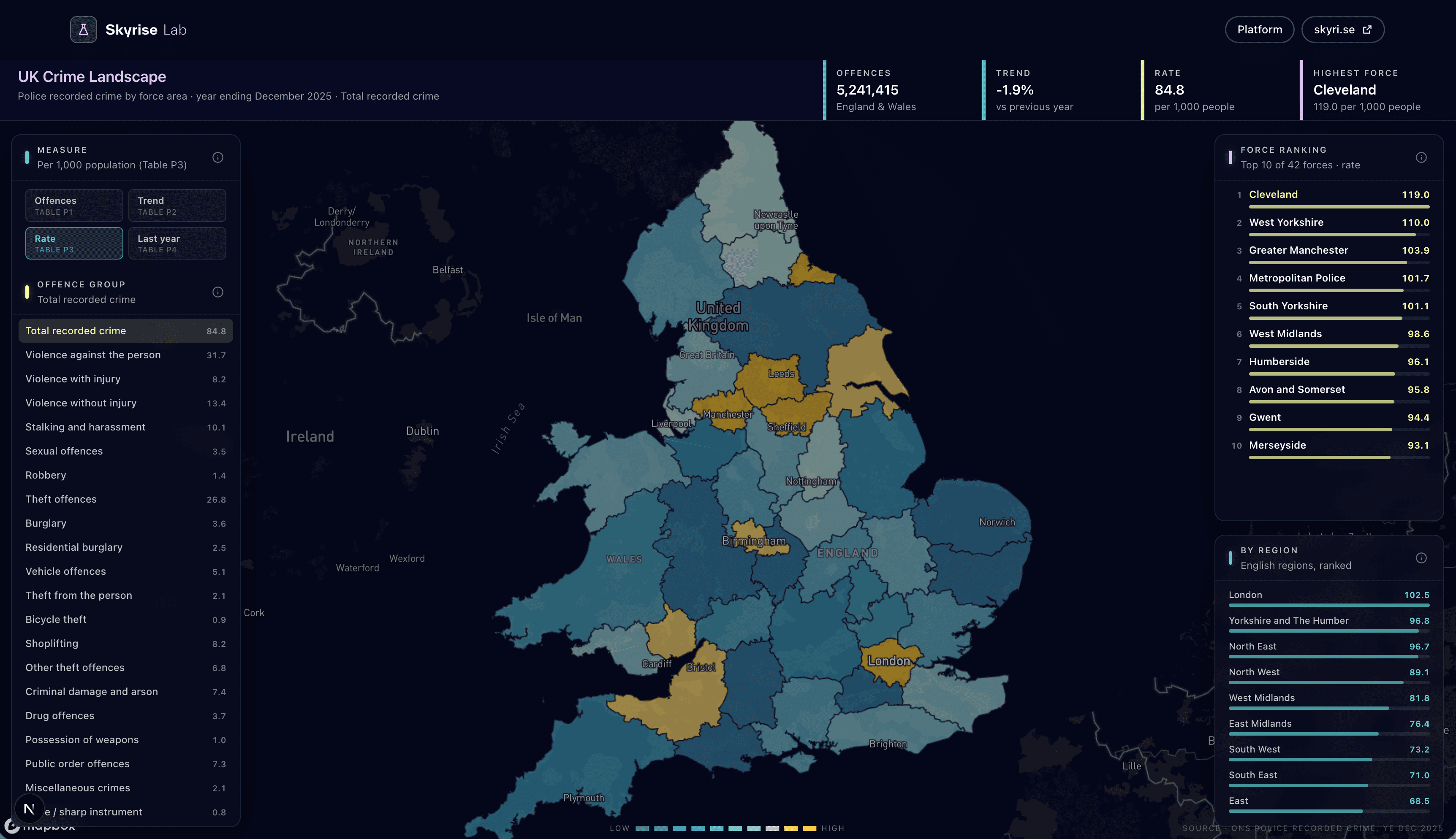
UK Crime Landscape is an interactive choropleth of ONS police recorded crime by police force area (year ending December 2025). It shows offence counts, rates per 1,000 people, and year-on-year change.
I wanted a quick way to see the data without drowning in tables. Counts matter. Rates per 1,000 matter more once you stop comparing London to a tiny force as if they were the same shape. Year-on-year change is where the story usually is.
Why I built it
Geospatial work shows up everywhere in our day job. This one is slightly sideways — not a media plan — but it scratched an itch: can we take a public dataset, put it on a proper choropleth, and make the comparisons feel honest?
Force boundaries are awkward. The data never arrives in the shape you want. Getting the map to feel fast enough to explore without lying about the numbers took more fiddling than I expected. I am fine with that. Maps that load pretty and measure badly are worse than no map.
Source: Office for National Statistics, police recorded crime by force area.
What to look for
Toggle between offence counts, rates, and year-on-year movement. Click a force area and sit with it for a second. If something looks off, it might be the data, the boundary, or my join — tell me which.
The interactive landscape is in the lab. Go click around.
Open the mapRelated in the lab
Questions
What dataset is this?
ONS police recorded crime by police force area, year ending December 2025. The map toggles offence counts, rates per 1,000 population, and year-on-year change.
Why a map instead of a table?
Counts without rates lie about London versus a small force. A choropleth makes those comparisons visible without drowning in rows.